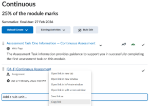
The Accessibility checker in Brightspace has four colours, red, amber light green and dark green. Each colour has a certain meaning.
The video below will provide a quick overview of the accessibility checker colours and provide an explanation for each colour indicator meaning.
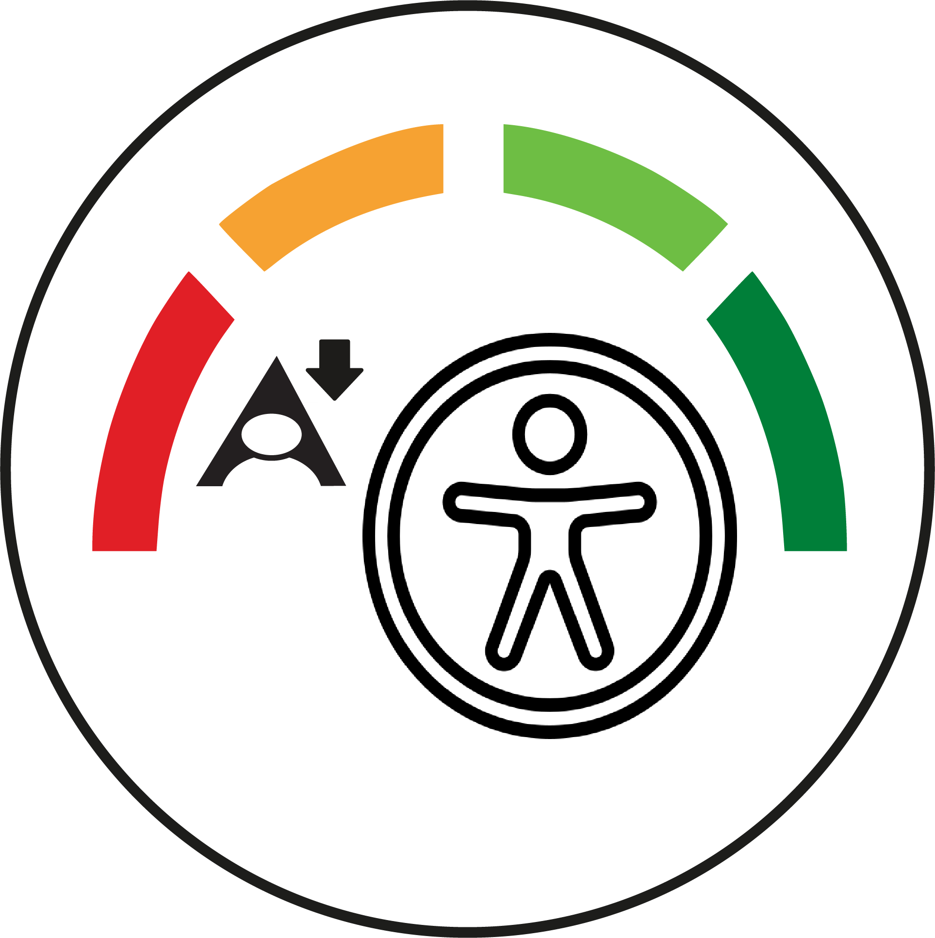
You should now have a good idea on what Red, Amber and Green icons in Brightspace are.
Please note: All information is accurate at the time of posting but the Brightspace / Teams layout may have updated.
For more help or information on this tool, check out the iPark website for handy how-to guides; or Brightspace Bytes on Brightspace for helpful screencast tutorials.